When planning an event, many organisers focus on logistics and staging while overlooking one of the most powerful atmosphere-shaping tools available: colour. Research shows that colours influence mood, attention and behaviour, which means they act as silent storytellers throughout your event. The right colour palette reinforces your message, elevates guest experience and helps you create a space that feels exactly the way you intend.
This guide explores the psychology of colour and offers practical ideas for selecting palettes that support different event types. It also includes suggestions for visual assets and opportunities to link to AVPartners styling services.
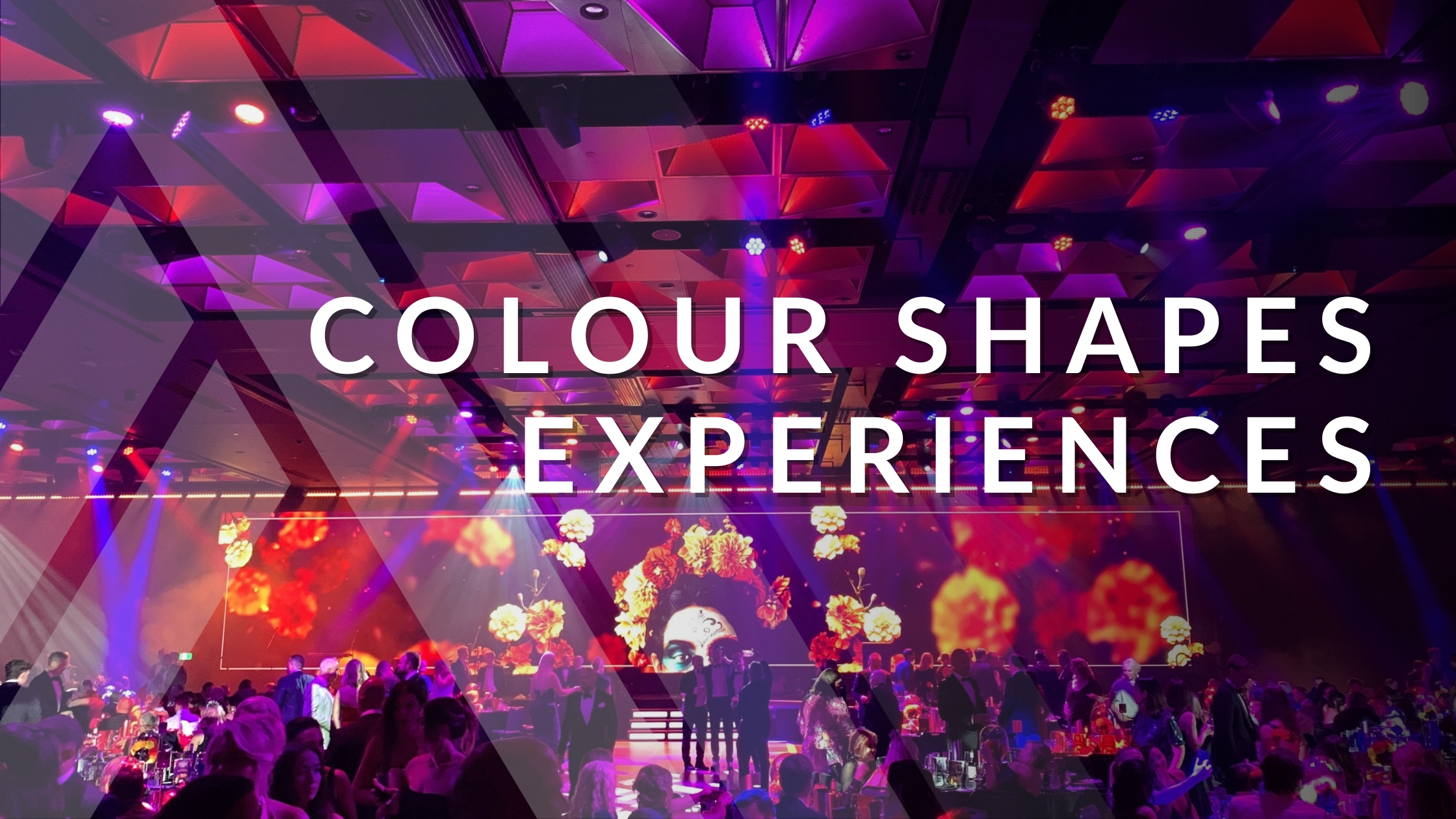
Power of Colour in Events
Colour psychology studies how hues influence thoughts, emotions and behaviour. Findings show that warm colours such as red, orange and yellow often increase energy and optimism. Cool colours such as blue and green promote calm and reduce stress. Bright, saturated colours stimulate alertness, while soft pastels provide comfort and a sense of safety. Even neutrals carry meaning: black represents power and elegance, while white signals purity and simplicity.
Warm Colours: Energy and Interaction
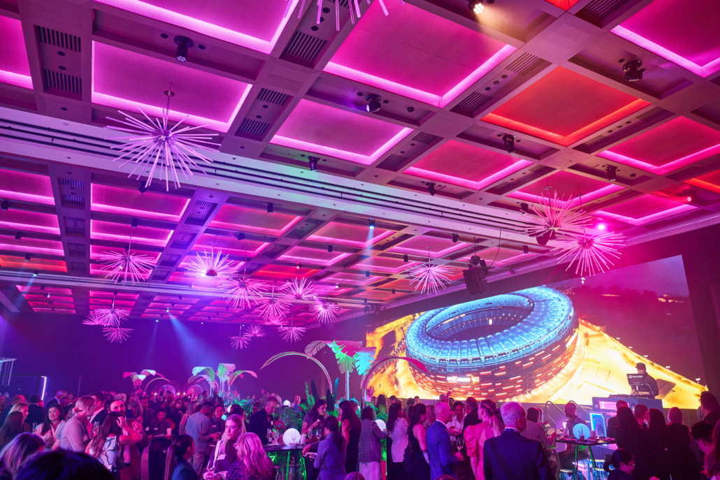
Warm colours like red, orange and yellow tend to command attention. Research links these hues with excitement, optimism and heightened energy. Red can increase heart rate and create a sense of urgency, which makes it useful for drawing attention to focal points. Orange encourages social interaction and a feeling of enthusiasm. Yellow communicates warmth and happiness, although too much can feel overwhelming, so it is best used in moderation.
Warm tones work well for networking events, celebrations, launches and activations where you want guests to feel energetic and engaged. Event designers often use amber or red lighting washes, warm uplighting on architectural features or floral elements that carry warm accents. Pairing warm tones with neutral shades prevents visual fatigue.
Cool Colours: Calm and Professional
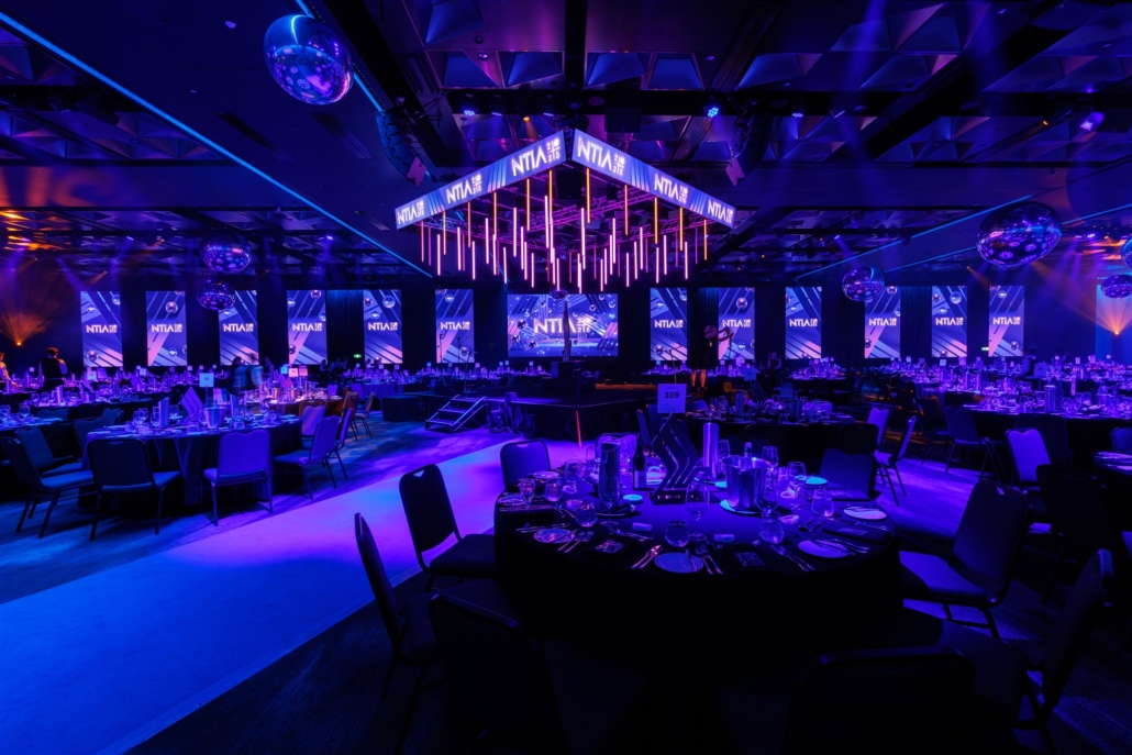
Cool colours such as blue, green and purple create a sense of calm and trust. Blue is widely associated with professionalism and stability. Green symbolises balance and renewal. Purple, which blends the grounded feel of blue with the energy of red, conveys creativity and luxury.
These colours suit conferences, awards dinners and formal galas. They help guests feel focused and relaxed while giving the event a polished, elegant tone. Designers frequently use cool colours through stage lighting, linens, floral arrangements or digital displays. A small amount of warm accent light, for example candlelight or soft tungsten fixtures, prevents the environment from feeling too clinical.
Visual idea: A wide shot of a gala dinner with soft blue and green uplighting to show how cool tones create a peaceful and professional atmosphere.
Dark and Neutral Colours: Sophistication and Contrast
Dark tones such as black, charcoal and deep navy evoke sophistication and authority. Event psychology studies emphasise that black communicates formality and elegance, which is why black-tie events feel luxurious. Too much darkness can feel heavy or somber, so designers often balance dark palettes with whites, metallic accents or warm highlights.
Dark themes work well for galas, awards nights and premium product launches. Lighting becomes especially important in these environments. Pin-spotting, textured projections, metallic décor and LED furniture create depth and prevent the space from feeling flat. Neutral colours such as beige and grey serve as grounding elements that tie bright and dark accents together.
Visual idea: A black-tie event with dark table settings contrasted against crisp white napkins and warm pin-spot lighting.
Bright and Vibrant Colours: Fun and Alertness
Bright, saturated colours like neon greens, hot pinks and electric blues communicate energy and excitement. Behavioural research shows these colours increase alertness and stimulate curiosity. They are ideal for celebrations, youth events or entertainment-focused evenings.
Use vibrant colours intentionally. Too many competing hues can feel chaotic. Accent lighting, LED installations and projection content that shifts with the music can create an immersive, high-energy experience without overwhelming the space.
Visual idea: A video clip of a dance floor with animated projections and changing neon lights.
Cultural and Contextual Considerations
Colour meanings vary across cultures. Some studies show that black symbolises sadness in many regions, while red represents love and green conveys contentment. White may represent purity in some cultures but is associated with mourning in others. When planning for diverse audiences, it is important to consider cultural interpretations to avoid unintended messages.
Demographics also influence colour preferences. Research indicates that women often lean toward softer tints, while men frequently prefer bold primary hues. These tendencies should not dictate your entire palette, but they can help refine the overall aesthetic.
Bringing Colour to Life with Lighting and Décor
Colour is expressed not only through décor but also through lighting design. Lighting is one of the most effective tools for shaping atmosphere because colours can shift throughout the event. Dynamic uplighting, coloured wall washes, ceiling projections and LED accents allow you to transition the room from reception to dinner to dance floor in a matter of seconds. Projection mapping can completely transform the environment and immerse guests in your theme.
AVPartners offers complete event styling services that integrate lighting, décor and audiovisual design. Our team can create custom colour palettes and lighting schemes that reflect your brand and elevate your event. Learn more about our event theming and styling services or contact us to discuss your next event.
Conclusion
Colour plays a powerful role in shaping an event experience. Warm hues encourage energy and connection. Cool tones support focus and professionalism. Dark colours signal luxury. Bright colours generate excitement. By understanding the psychology behind colour and tailoring your palette to your goals, you can create events that feel cohesive, memorable and aligned with your message. If you are ready to elevate your next event through thoughtful colour design, our team would love to help bring your vision to life.